A Visual Case Study on Betty Boop, Race and Representation.
Created in 1930 by Max Fleischer and Grim Natwick at Fleischer Studios, Betty Boop emerged during the Jazz Age. Her early design was heavily inspired by Black jazz performers, particularly Esther Jones (“Baby Esther”). Her style influenced Betty’s signature “boop-oop-a-doop.” Betty was animated and made to be marketed as a white character during a period when Black artists were rarely credited or represented in mainstream media and animation.
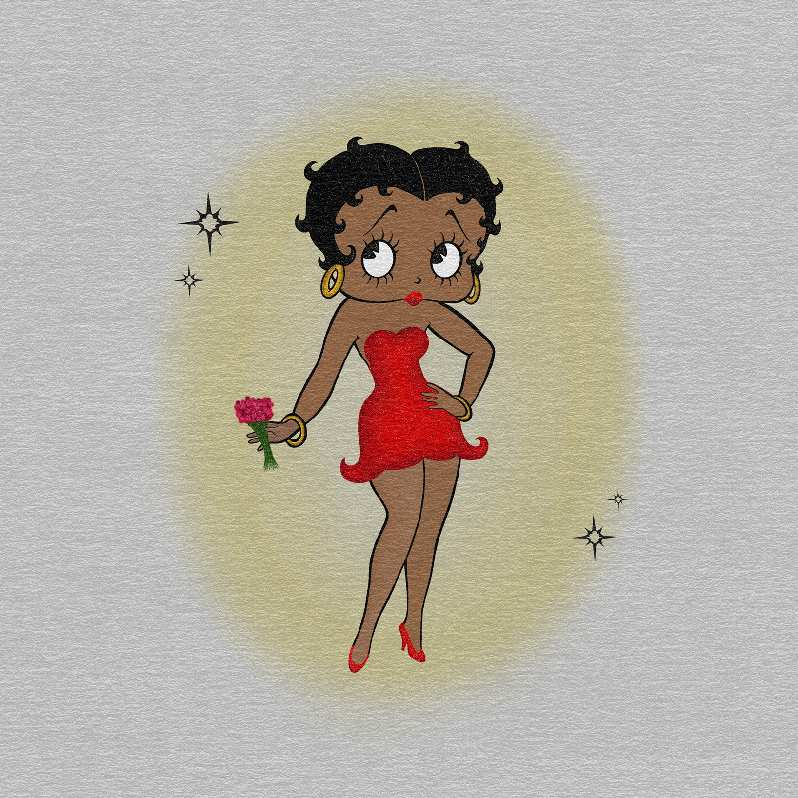
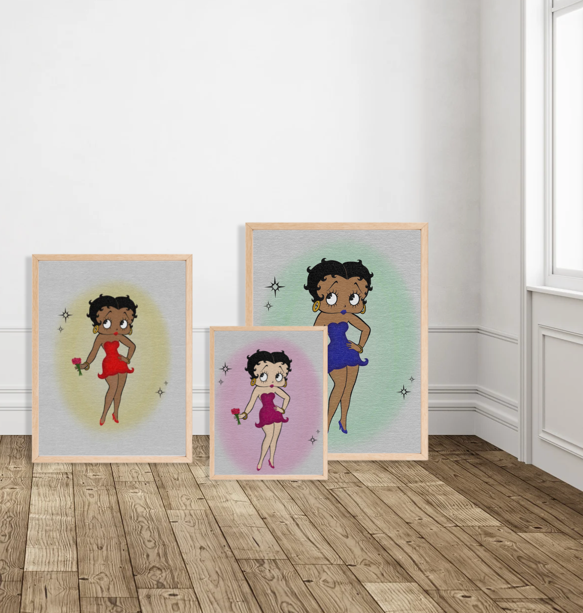
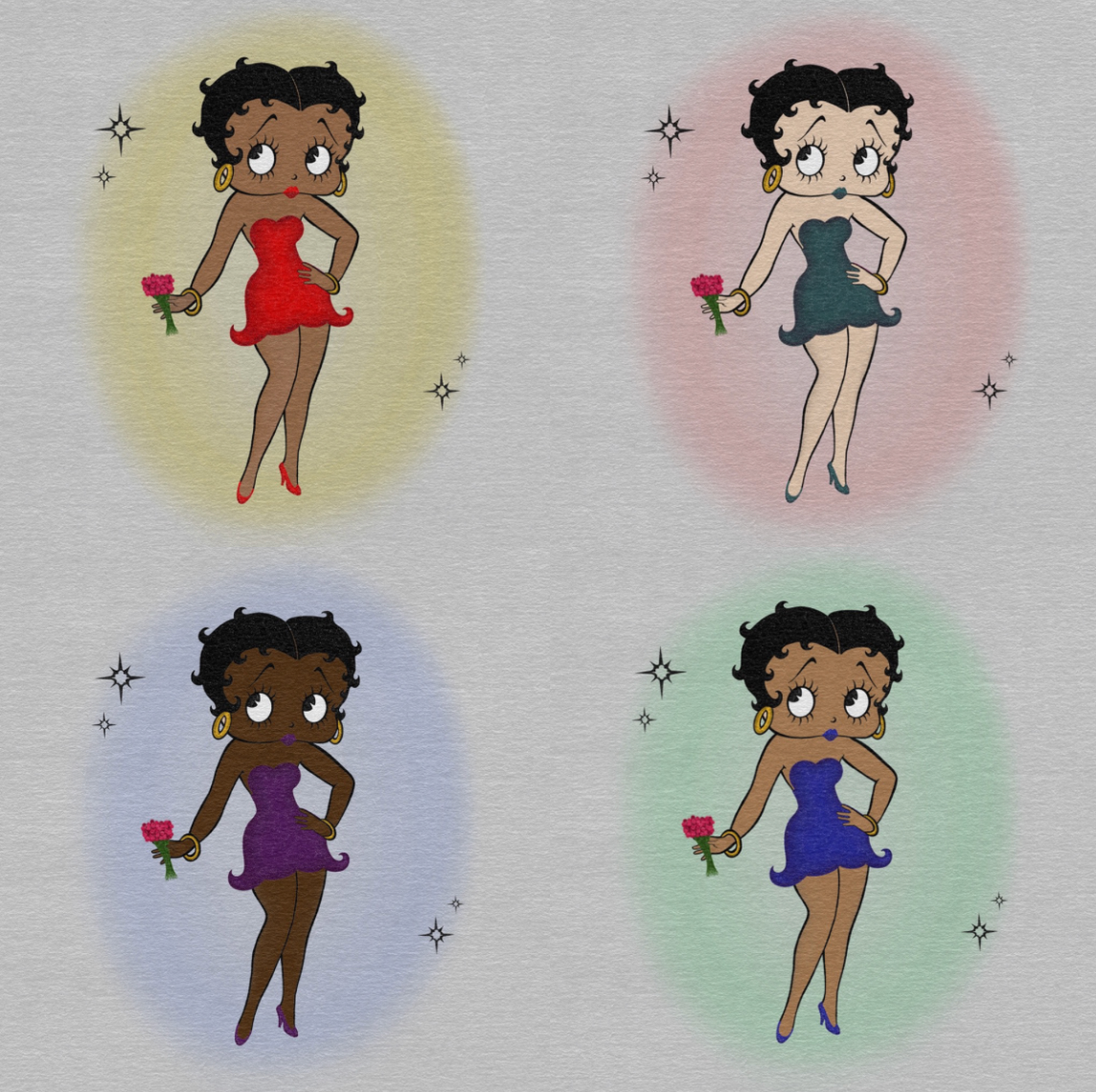
This project reimagines Betty Boop in multiple skin tones to challenge how race impacts representation in 20th century animation and media. By staying true to her iconic silhouette and stylistic features while altering complexion and color palette, the work expands the character’s identity. This design reflects broader racial representation and positions her form as inclusive rather than racially fixed.
Through repetition and variation, the series challenges the historical centering of whiteness in legacy media and proposes a more inclusive visual lens. The project positions illustration as a method of critical reflection, expanding authorship and reconsidering who is permitted to embody cultural icons.
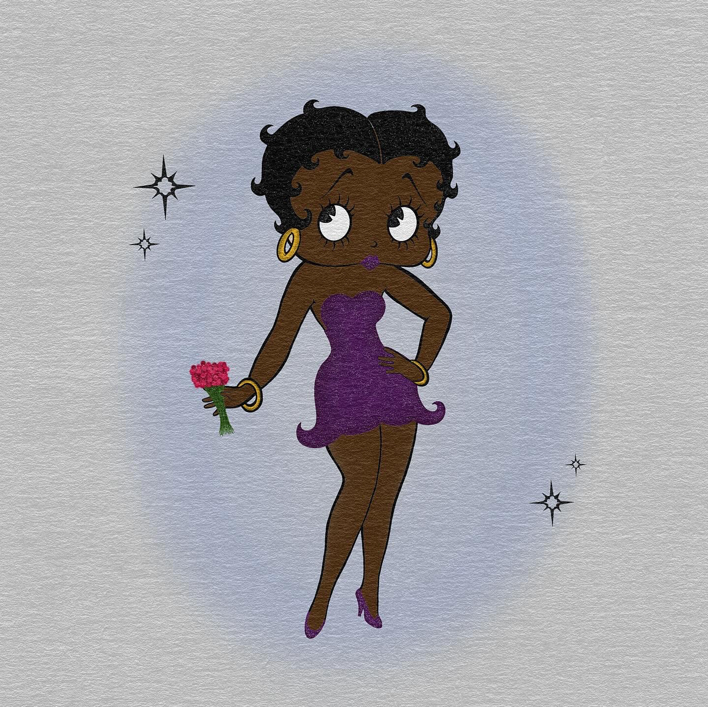
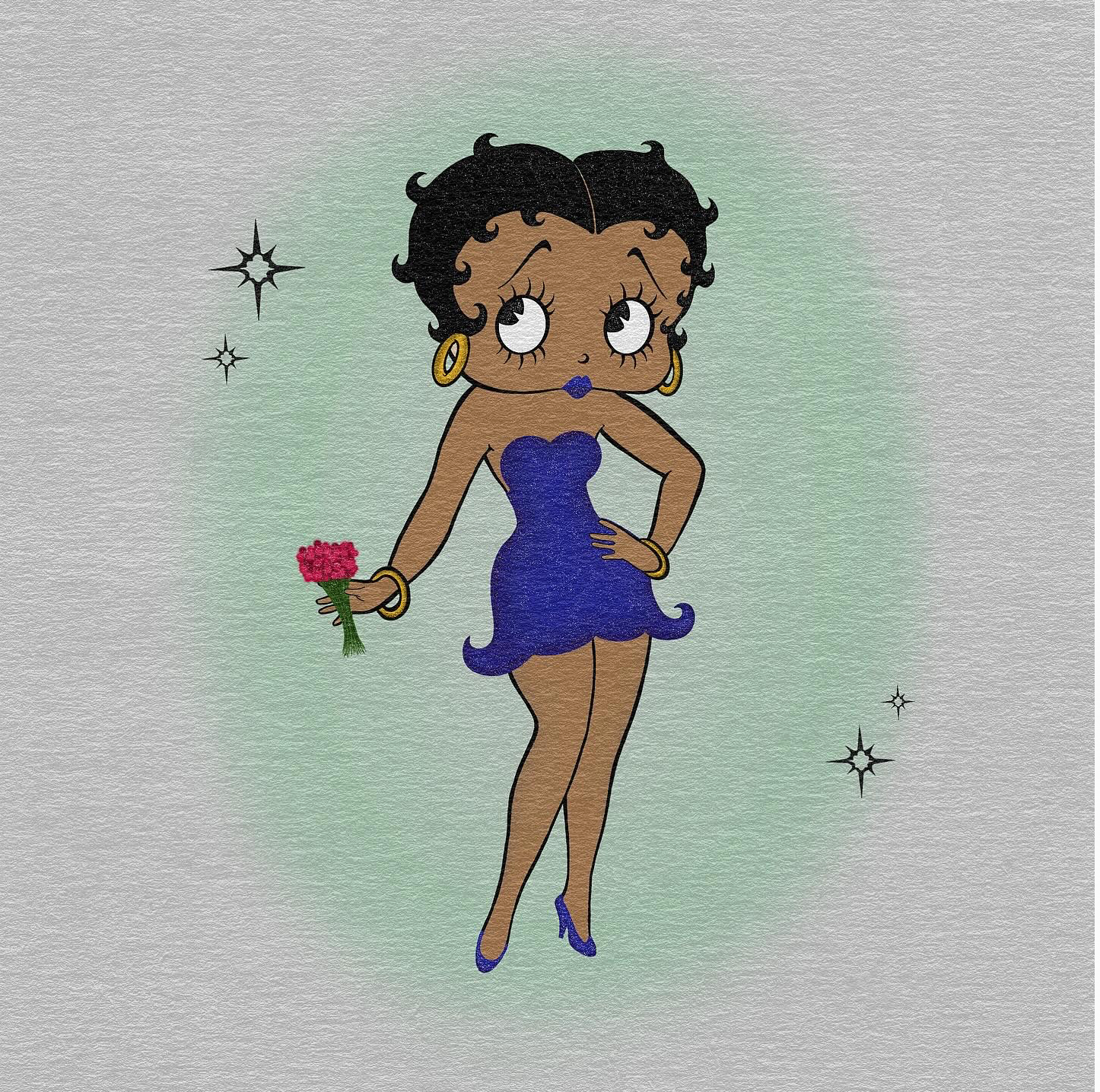
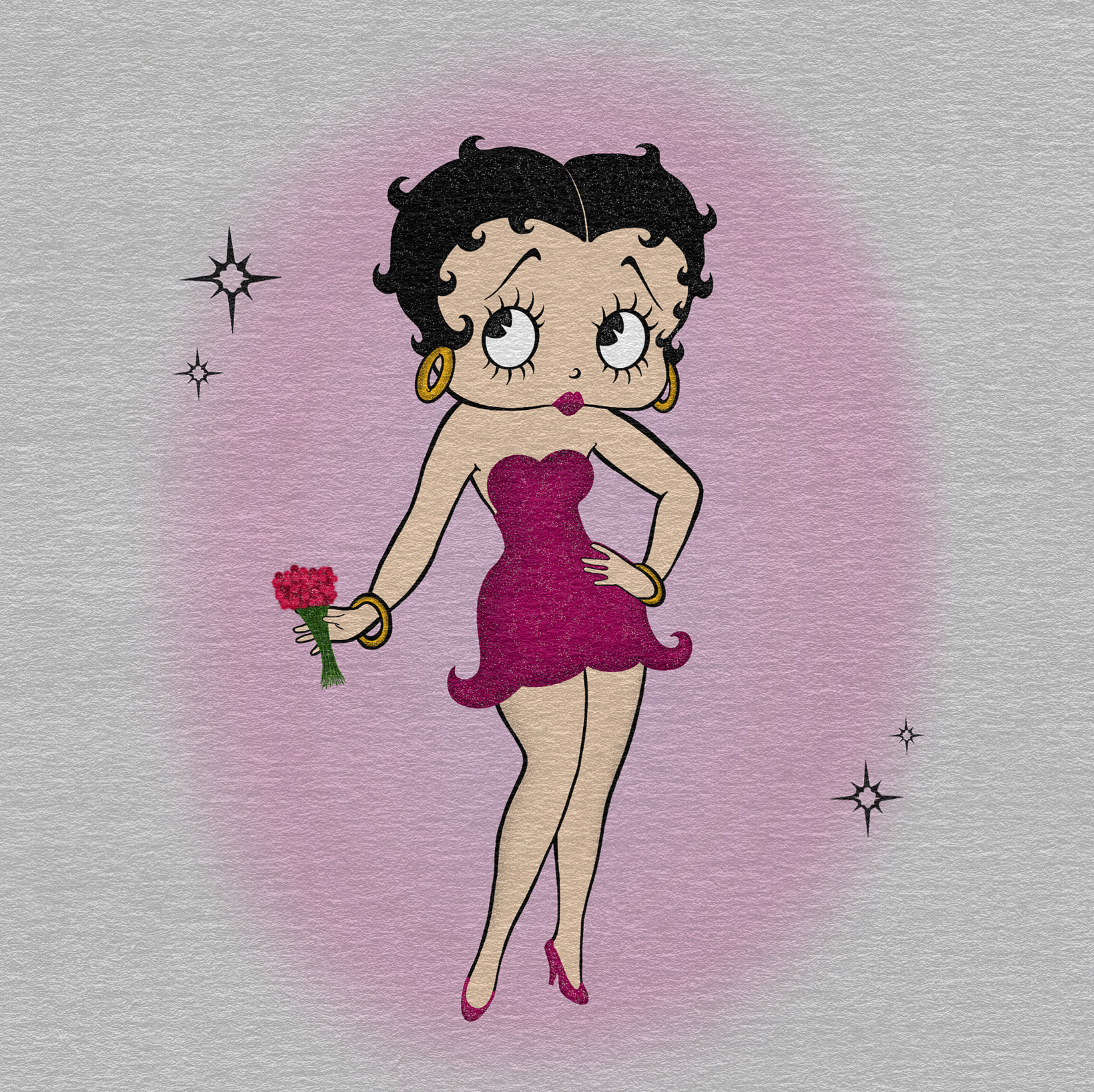
Betty Boop originated in the United States but is popular across many diverse cultures. She remains an American pop icon but is widely embraced in Japan’s character and fashion culture. She also appears frequently in Latin American and Chicano culture as a symbol of bold femininity and glamour. Her image is also prominent in vintage, retro, pin-up, and tattoo subcultures worldwide. Her character has been reinterpreted and adopted across racial and cultural communities.
Poster Mockup: